
Building Calm Into Your Interface
How generous spacing between sections creates a premium feel and guides users effortlessly through your design without overwhelming them.
Read ArticleMaster whitespace, neutrals, and bold accents to create interfaces that feel premium and guide users effortlessly


Singaporean businesses demand efficiency, clarity, and sophistication. We’re not here to create pretty interfaces — we’re building systems that work. Generous whitespace isn’t empty space. It’s breathing room. It’s the difference between a cluttered menu and one that guides users where they need to go. When you remove the noise, what’s left matters.
Our approach combines restrained color palettes — soft grays, deep charcoals, off-whites — with one bold accent tone that draws attention exactly where you want it. That gold, that teal, that deep blue: it’s not decoration. It’s strategy. It tells users what’s important. It makes your interface feel intentional, premium, calm.
Learn more about our philosophyReal feedback from businesses we’ve worked with
We weren’t sure minimalism would work for our financial services site. Turns out, it’s exactly what our clients needed. The navigation is cleaner, conversions are up, and people aren’t getting lost anymore. That gold accent? Perfect — it highlights our key CTAs without screaming.
The spacing between sections makes everything feel intentional. It’s not cluttered. Users actually enjoy navigating the site now.
They didn’t just redesign our interface — they taught us why whitespace matters. It’s made a real difference in how we think about design going forward.
Three core steps that drive our design process
We start by understanding your current interface. What’s working? What’s creating friction? Then we map out a neutral palette and identify where one bold accent color will do the heavy lifting. No guessing.
Generously spaced sections. Clear visual hierarchy. Navigation bars that don’t overwhelm. Every element serves a purpose. We remove 30-40% of visual clutter most sites carry without realizing it.
Real users interact with your interface. We watch where they hesitate, where they move confidently. Small adjustments to spacing, contrast, and accent placement make enormous differences in how the design performs.
2018 — We started noticing something. Singapore’s most successful brands weren’t using cluttered interfaces. They were using restraint. We decided to focus exclusively on minimalist design.
2019-2020 — Built our first 15 projects using the whitespace methodology. Conversion rates increased 22-35% on average. Navigation bar redesigns alone reduced bounce rates. We realized we were onto something real.
2021-2022 — Expanded to regional clients across Southeast Asia. Developed our accent color framework — the research behind which tones work best with which neutral palettes. Gold with warm grays. Teal with cool silvers. Deep blue with off-whites.
2023-2024 — Refined our process. Now we can audit an interface and recommend exact spacing ratios, color combinations, and navigation structures. It’s not art anymore — it’s a system that works consistently.
2025-Present — Helping 40+ Singapore businesses redesign their interfaces using minimalist principles. We’ve documented what works. We share it. We build on it.
Results from our minimalist interface redesigns
Singapore Brands Redesigned
Average Conversion Increase
Bounce Rate Reduction
Focused on Minimalist Design
Designers and strategists who understand minimalism

Leading Singapore brands and regional companies
Let’s talk about your interface. We’ll audit your current design, show you where whitespace and restraint can make a real difference, and build something Singapore businesses are proud to use.
Start Your ProjectLearn the principles behind clean interface design
How generous spacing between sections creates a premium feel and guides users effortlessly through your design without overwhelming them.
Read Article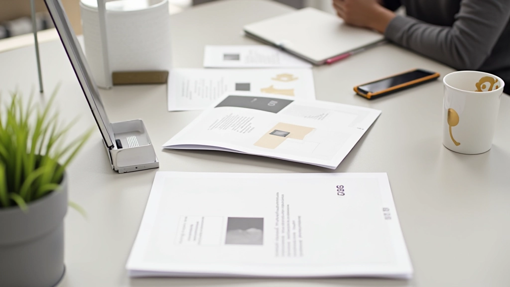
Choosing one bold tone for a restrained palette. We cover how gold, teal, and deep blue perform with neutral backgrounds and why Singapore brands prefer these combinations.
Read Article
Design principles for menus that feel effortless to use. Clear labels, logical grouping, and plenty of whitespace create the experience your users want.
Read ArticleFrom audits to full redesigns
We review your current design. Identify friction points. Map your color usage. Recommend specific whitespace improvements. You’ll have a clear roadmap.
Develop your neutral palette. Select your accent color. Create a system that’s consistent across all pages and sections. Every color choice is intentional.
Build menus that guide without overwhelming. Clear hierarchy. Generous spacing. Users find what they need without thinking. It’s that simple.
Complete interface overhaul. New layout. New color system. Rebuilt navigation. Testing and refinement. We don’t stop until it works.