Why Balance Matters
It’s not about symmetry. Real balance on a web page comes from understanding negative space and the relationship between what you show and what you don’t. When text and images fight for attention, your reader feels rushed. When they’re intentionally spaced, your page becomes a place they want to spend time.
We’ve worked with over 150 Singapore-based companies on their web presence. The sites that converted best weren’t the ones crammed with features — they were the ones where every image served a purpose and every paragraph could breathe.
The 60-40 Rule
Most pages benefit from a simple ratio: 60% of your layout is content (text, UI elements, data), and 40% is breathing room (margins, padding, whitespace). This isn’t rigid — it’s a guideline.
When you’re designing a feature-heavy page with lots of information, the 60-40 rule prevents that overwhelming feeling. A designer we worked with at a fintech company applied this to their dashboard. Before: seven different card types competing for space. After: same information, but 40% more whitespace between sections. User engagement went up 23% in the first month.
Images need room too. Don’t shrink an image just to fit more text beside it. If an image deserves to be there, give it the space it needs — usually 45-55% of the layout width.
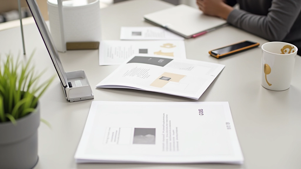
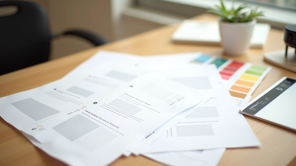
Images as Content, Not Decoration
Here’s where many sites get it wrong. They treat images like afterthoughts — squeezing them in to “add visual interest.” Real imagery strategy is different. Each image should do something: explain a concept, show a real person or situation, or reinforce what the text is saying.
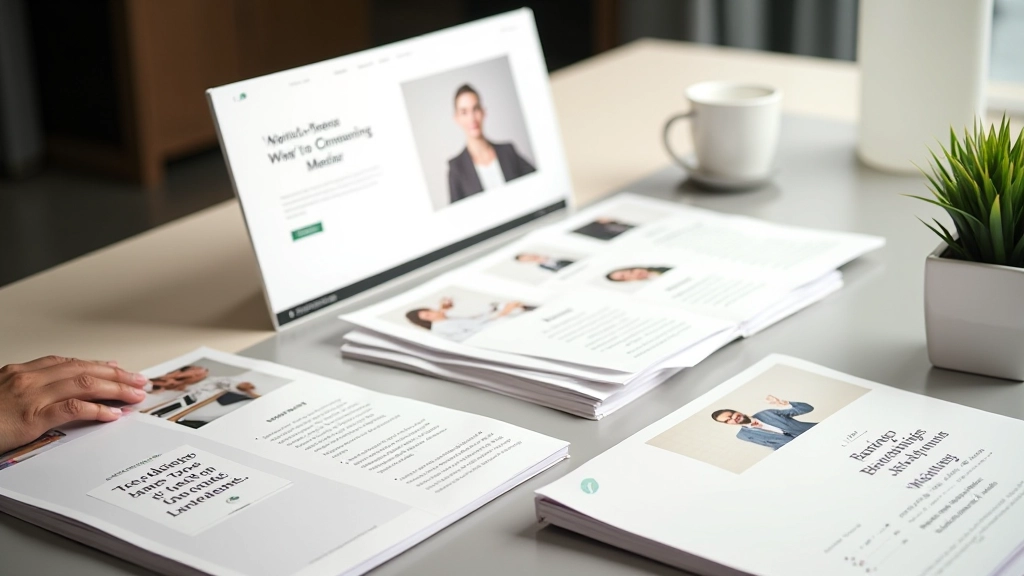
A lifestyle brand we designed for in Singapore had beautiful product photography. But they were sizing images at 30% width with text wrapping around. The images felt secondary. We restructured the entire layout to alternate: full-width image, then a section of text and information, then another image. Same content, completely different feel.
The key detail: when an image takes up 50% or more of a section’s width, pair it with equal-width content on the other side. When images are smaller (thumbnails, small accent photos), they work differently — they can sit within text or be grouped.
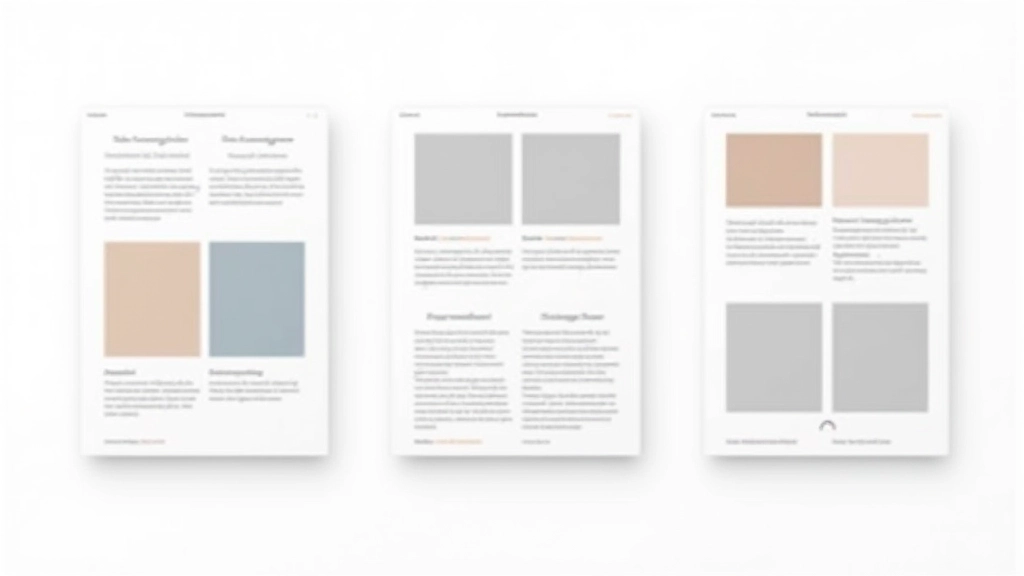
Creating Intentional Grids
You don’t need complex grid systems. Most minimalist sites work beautifully with simple proportions. A two-column layout with 50-50 split works for: hero + image, feature description + product photo, or text block + sidebar info.
When columns aren’t equal, common ratios are 65-35 (text-heavy) or 40-60 (image-focused). What you’re avoiding is the awkward 70-30 split where one element dominates while the other feels squeezed.
Mobile changes everything. On small screens, your two-column layout becomes single-column. Images that were 50% wide now span full width. Text blocks expand. Don’t shrink images for mobile — give them breathing room. A full-width image at 320px can look beautiful if the text beside it has adequate padding.
Whitespace Between Sections
Padding and margins aren’t wasted space — they’re structure. A minimalist page often uses 3-4 rem of padding between major sections. That’s roughly 48-64 pixels on desktop, which feels generous but not excessive.
Between an image and text within the same section? 2-3 rem gap. Between paragraphs in a text block? 1-1.5 rem. These proportions create visual hierarchy without any designer having to think about it.
The subtle magic: consistent spacing. If every image-text pair has the same gap, every section has the same padding, and every list has the same item spacing, the entire page feels composed and intentional. A Singaporean B2B site we worked with used 2 rem consistently. Their pages looked calmer than competitors using varied spacing, even though the content was similar.
The Feeling You’re After
Balance isn’t mathematical. It’s about creating a page that doesn’t exhaust the reader. When someone lands on your site, they shouldn’t feel rushed. They shouldn’t scan frantically for what’s important. Instead, the balance between text and imagery should guide them naturally — image, then the explanation, then a section break to breathe, then the next idea.
Start with the 60-40 rule. Give images real width. Use consistent spacing throughout. Let your content breathe. These principles work whether you’re designing a corporate site, a portfolio, or a blog. The result isn’t minimal in a cold way — it’s minimal in a confident way. Every element has a reason for being there.
Disclaimer
This article presents general design principles and best practices based on industry standards and our experience working with Singapore-based businesses. Specific implementation may vary based on your audience, content type, and business goals. We recommend testing design changes with real users and adjusting based on their behavior. Design decisions should always align with your brand strategy and accessibility requirements.